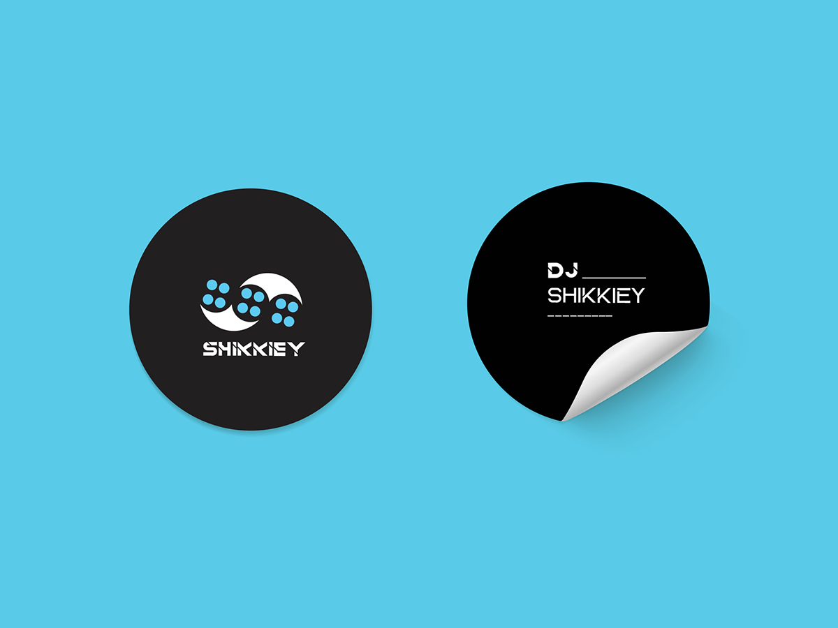

Experimenting with different typography that best fits with the Logo

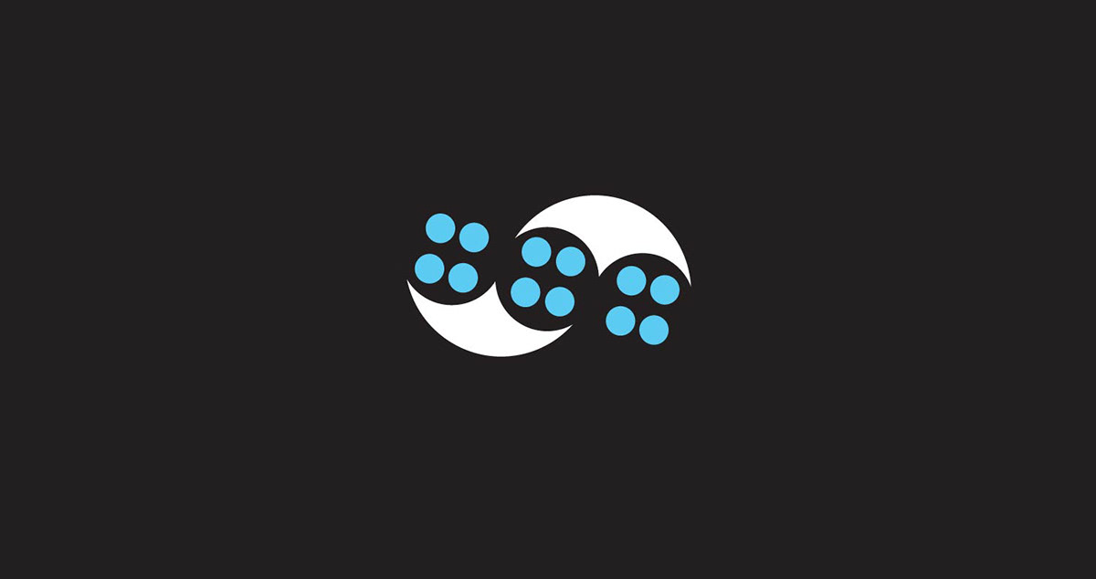
This is where my idea began. A stylistic, Symbolic letter representing the artist's name.
The Logo is the word letter S. Not to make it too obvious and add more fun to it, i added the 12 small circles, i wanted to show the buttons(gain) that are on a mixer but didn't look too appealing. That's why i settled for the electric blue instead.
All the Typography has been adapted from Sesohq


